South Point Digital Transformation
Dotslash partnered with South Point to connect the students to staff, with total transparency.
Client: South Point.

The Challenge.
With the exponential increase of students staying at South Point Accommodation, they struggled to keep track of all the maintenance of all of the student rooms and buildings across South Africa.
The Outcome.
Greatly increased the rate in which faults are attended to, and prevented any missed or lost logs.
In 2015 South Point student accommodation grew, their buildings got larger and so did their amount of tenants.
By the beginning of 2019, the magical experience of staying at South Point started to fade, due to the long turn around time on fixing faults in the rooms.
We embarked on an ambitious undertaking to redesign and streamline the whole maintenance process for one of the biggest student accommodation enterprises in South Africa.
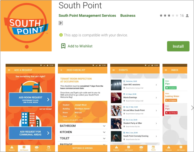
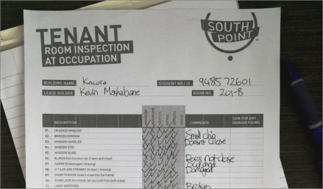
With the increasing amount of new students, keeping track of what needs to be fixed, reporting faults, and keeping the progress transparent to the student, has become difficult to manage. Before the solution, they have used a traditional system of putting all the reports and faults on paper that is reported from the student via an outdated mobile app.
Our goal was to streamline the communication between the student and the staff.
The student needs to be able to quickly and easily report a fault in their room, and the maintenance team needs to be able to see the fault reported and tend to it.
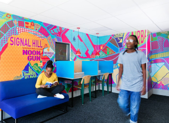
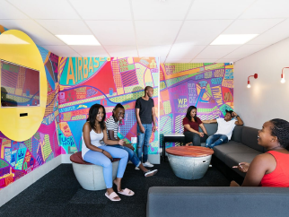
We were in constant communication with the South Point team to fully understand all of the complexity of their current system and how we can redesign it.
The managers held weekly meetings to keep each other posted on the progress and grew a healthy collaborative relationship.
The Team.
To first redesign the whole maintenance reporting process, we first need to understand it.
The team interviewed staff and students to find out where the pain points are in the current system they are using.
South Point has received numerous negative feedback on their social media page, most of them are complaining about the lack of support with maintenance. On further investigation, this has more to do with the current system that is unable to handle such a vast amount of request, than it has to do with their staff.
Main Concerns.
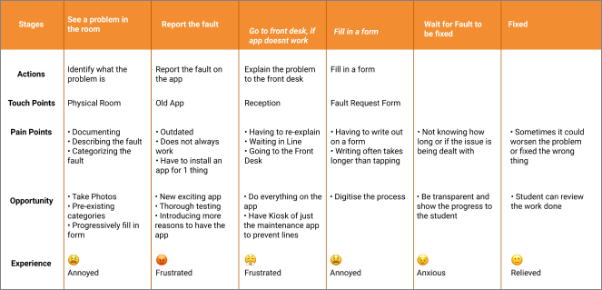
Through several usability research of the current system to log a fault in the student's room or communal area, we have realised that there were a few problems.
Students logging the fault on the outdated app, that does not log it successfully and thinking it has been logged while it did not. Therefore causing a long turn around time on fixing the issue.
Sometimes if the issue is important such as a leaking pipe, then the longer it takes to fix the issue, the more damage it will cause.
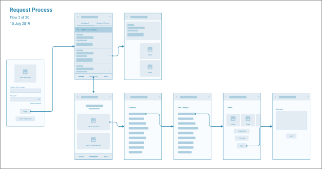
As the project got larger and larger due to scope creep, we decided to break the project into segments and wireframe them. This decision was made as we see that users only go onto the app for one thing at a time, therefore allowing more modularity between the different section of the app.
After usability testing of the wireframes and a few reiterations to really refine what information should be shown when and where so that the process feels short, even though there is a lot of requirements that makes the process quite lengthy.
Once we got the foundation down, it's time to figure out our paint colours. This is where we direct how the user's feelings and emotion to the brand.
Once we got the hi-fidelity mockups up and running, its time to put them through some more usability testing, to see if adding colours would improve or degrade the user experience.
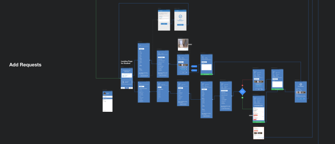
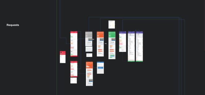
The team was happy with the overall navigation of the app, the users showed little to no problems with adding a fault.
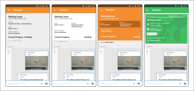
However, we felt that viewing the fault's progress could be improved, the challenge is to display a vast amount of information without overloading the user.
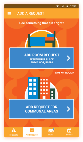
We have divided adding a fault request into 2 sections, the first section is for the student's room, this way we can pre-fill a lot of the information that we already have.
The second is to add a fault for communal areas, which we can then hide a lot of irrelevant information.
We have also streamed line the adding request process, to minimise user errors as well as making the process as least effort as possible.
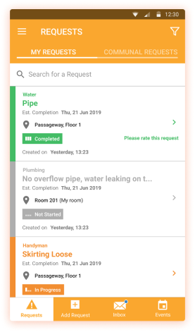
As a way to make the request process as transparent as possible for the students, we show the student a list of all the request that they have requested and indicate their process as well.
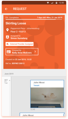
Each request item will display their relevant information, such as when their estimated completion times are, comments and communication from the staff.
Students can also add images and send texts to the staff in context to the currently selected request.
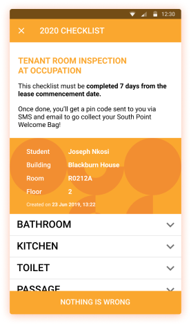
This is only for when the student first checks into their new room, they go through their room and mark down what is wrong, then everything they marked will get converted into a fault to be repaired and fixed.
After launching the app during November - December time
This is before their intake period of all their students, so making sure that everything works smoothly before a huge influx in traffic is crucial.
After launching the app to the huge amount of students, we have paid close attention to the app and monitoring users responses.
After a few weeks, we have seen less maintenance complaint, and more complaint about not knowing that this app is for maintenance only, as the students expected a wider scope from this app.
This opens up new opportunities for innovative ideas to add to the app that can improve the experience of the students.